Branding · Illustration · Package Design
GumHaven Gummies
There’s no doubt about it, gummies are fun. They’re wiggly, they’re sweet, and they’re shaped like little critters in a way that somehow avoids being horrific as you bite their head off. But what if there was more to the story? The GumHaven rebrand project explores the idea that perhaps somewhere, beyond the edge of the map, exists a secret world, El Dorado or Atlantis style, in which the gummies truly are alive.
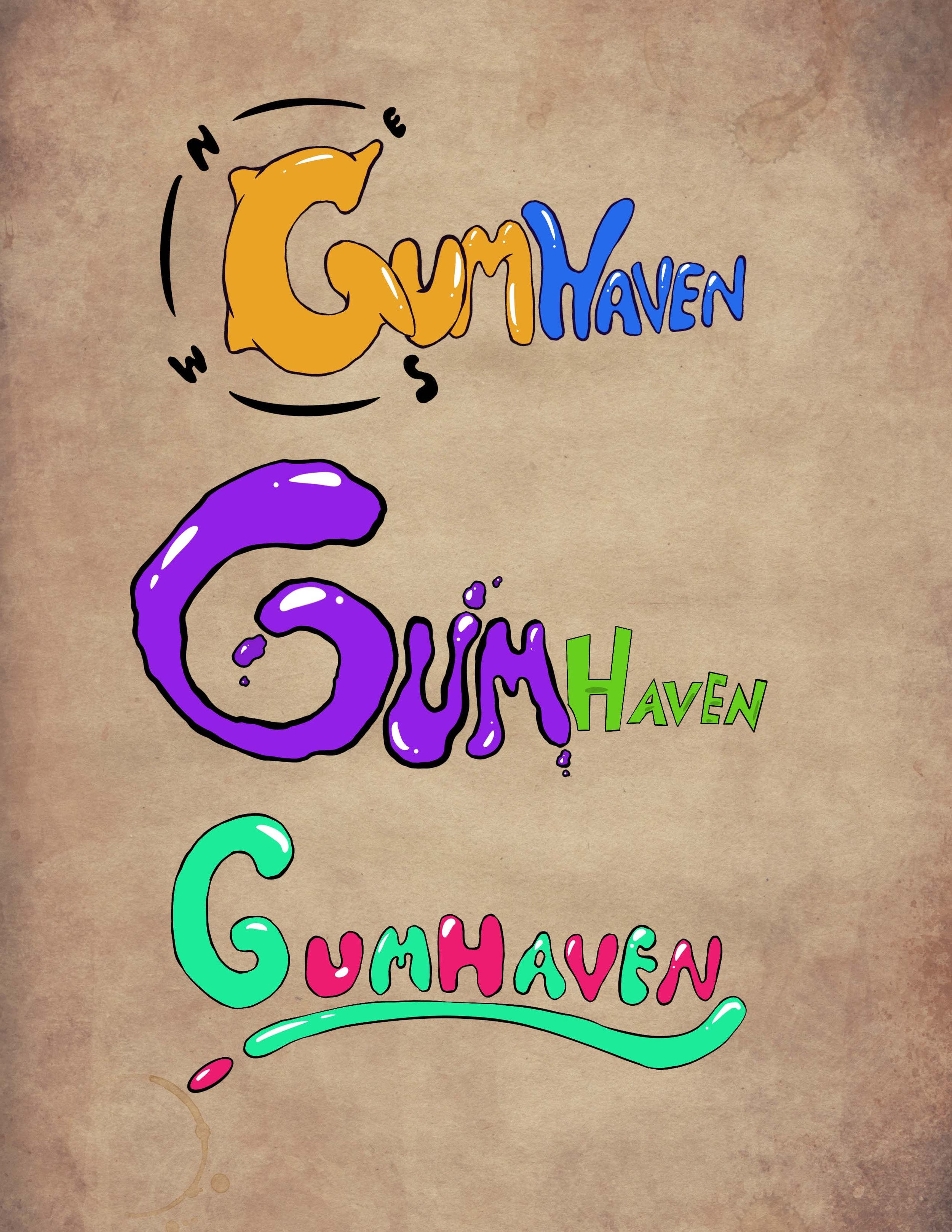
As a combination branding and package design project, I iterated and built the GumHaven brand from the ground up. I knew early on that I wanted an explorer theme, and for a while called the new brand “Sweest,” explaining to my peers that it indicated a new cardinal direction, and without the right compass was impossible to find. I’m still rather fond of that name, but decided it looked an awful lot like a typo of someone trying to say “sweets,” and was convoluted without my accompanying lore explanation.
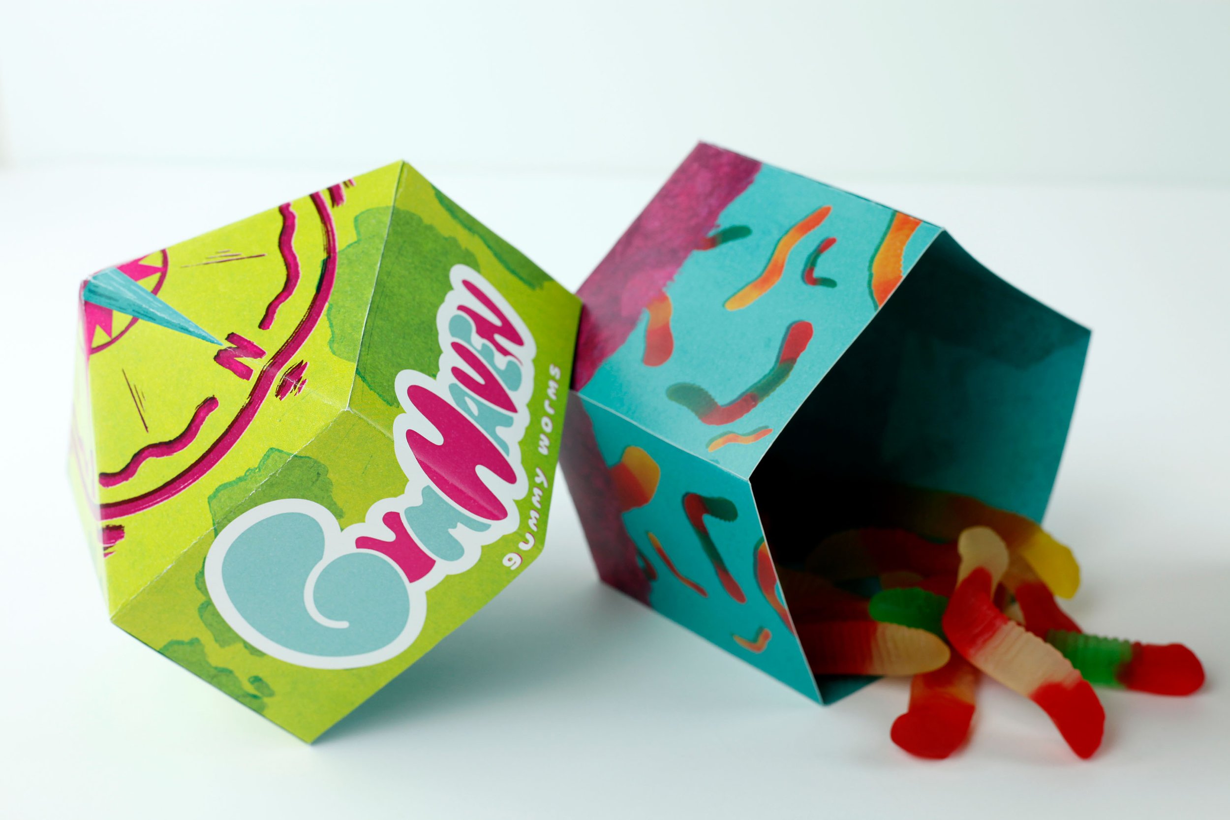
The package itself was inspired by Harry Potter’s chocolate frog boxes, and was a fun challenge figuring out how to design and print so that it folded into that unique pointed top. It was important to me that the package felt special, and as the original product was sold in a plastic bag I wanted something worth keeping after the feasting was done.


